
Overview
Role: Product Design (UX/UI)
Timeline: 10 months
Tools used: Notion / Miro / Figma
Timeline: 10 months
Tools used: Notion / Miro / Figma

The company
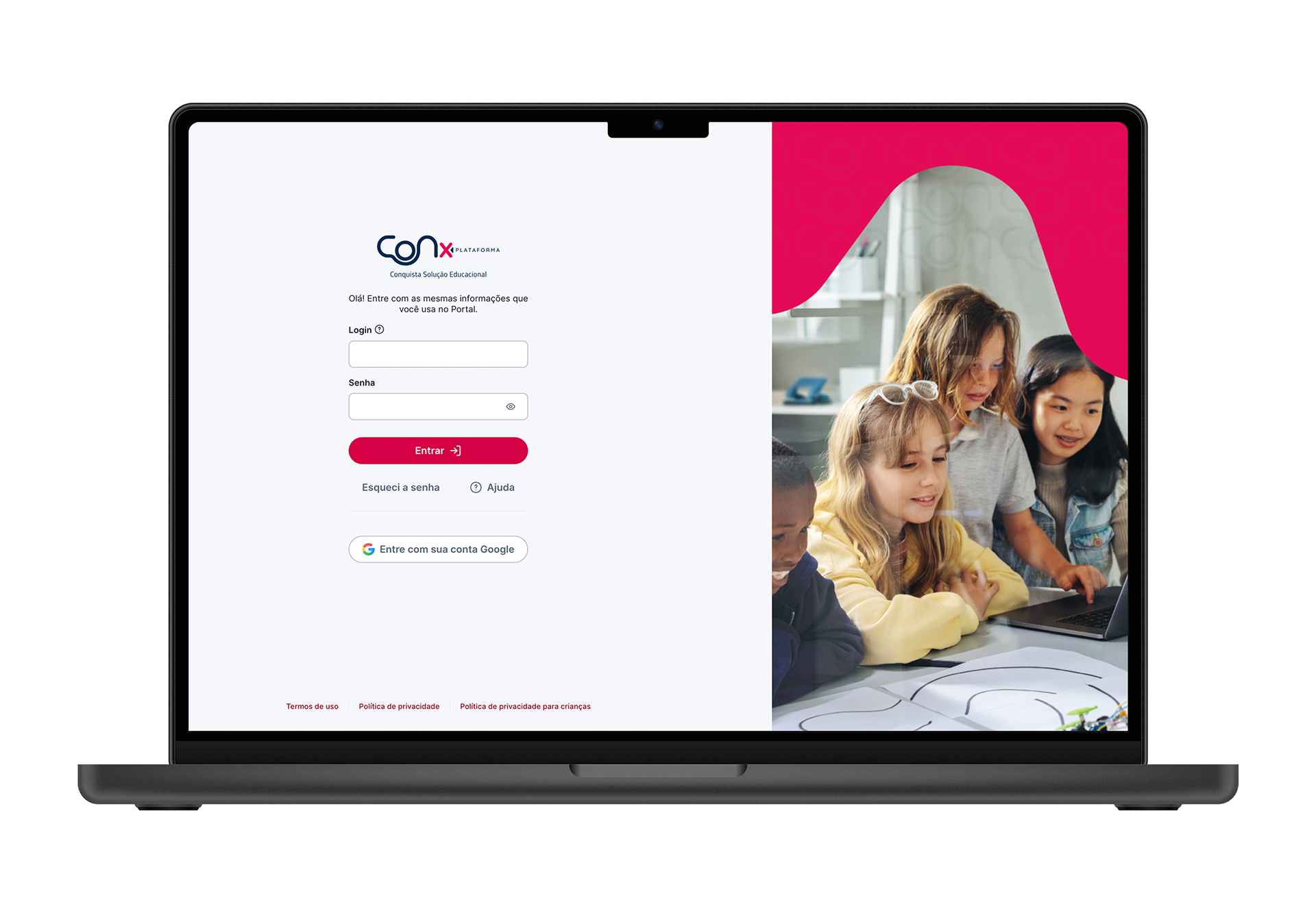
Conquista Portal is an Arco product, created in 2013 with the goal of providing a solution that integrates families, schools, and school management. School administrators, teachers, and students have access to the platform, while families can closely follow students’ development and learning progress.
First version
The first version of the product was developed before I became involved in the project. There was no dedicated product designer at that time, and several usability issues had accumulated.

Problem
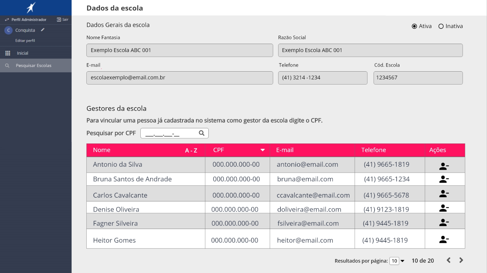
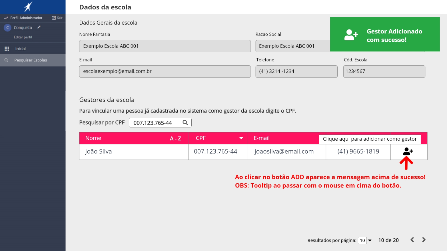
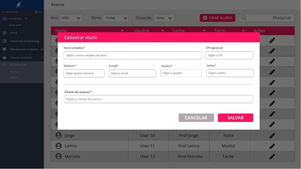
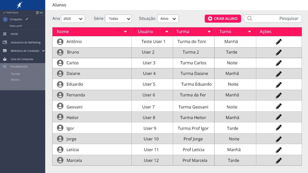
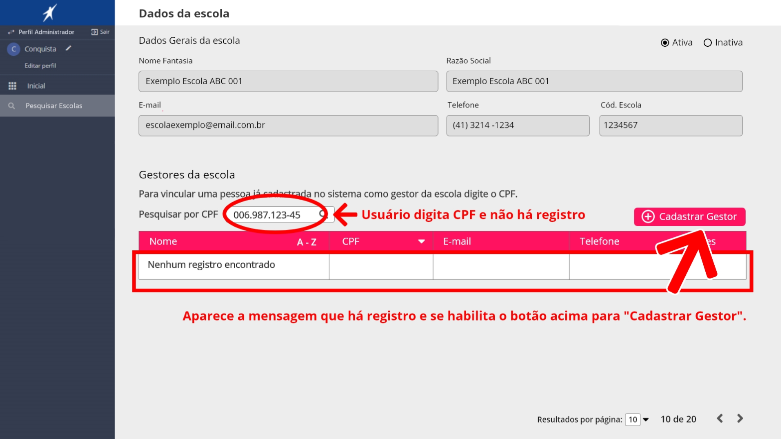
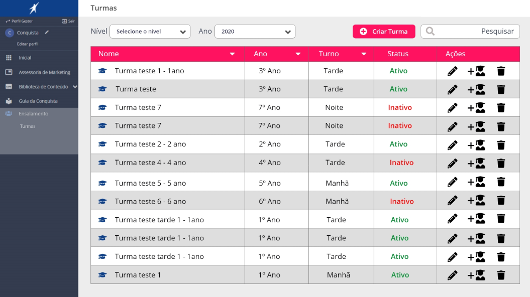
Portal Conquista is an educational platform created to connect students, school administrators, teachers, and families. However, the current experience presents several usability issues that make important tasks difficult and time-consuming. One of the main problems is the student enrollment process (“ensalamento”), where school managers need to create classes and register teachers and students. Because this process involves many people and multiple steps, it often becomes confusing, bureaucratic, and hard to complete efficiently. In addition, families have limited engagement with the platform, as the portal currently works mostly as a place to check grades and academic records, instead of offering a more helpful and intuitive experience to follow a student’s learning journey. As Arco aims to strengthen its brand and stand out in the educational market, there is a clear opportunity to improve the Portal Conquista experience, simplifying the enrollment workflow and creating a more useful and accessible platform for school staff and families.
Project Goals
Improve the Portal Conquista experience by simplifying the student enrollment (“ensalamento”) process, making it faster and easier for school managers to create classes and register teachers and students. Additionally, enhance the platform’s usability to provide families with a clearer and more engaging way to follow students’ academic progress, transforming the portal into a more intuitive and supportive educational experience beyond simply viewing grades.
The process
To frame the process, I used the Double Diamond model (Design Thinking), moving from discovery to definition, and from development to delivery. While full delivery wasn’t complete at the time, we successfully worked through the first three phases.

Discovery
Users interviews + competitor analysis
Define
Pain points, goals and persona
Development
Wireframes + flows + prototypes
Deliver
Usability testings and revisions
Goals & User Interviews
To begin my research, I conducted interviews with managers and coordinators who were already using the portal on a daily basis. I asked users how often (if ever) they found themselves with an overloaded schedule, what their routine was like, and if they ever felt stressed while performing any tasks. I focused on how they completed the registration process, what frustrated them, and what they felt was missing.
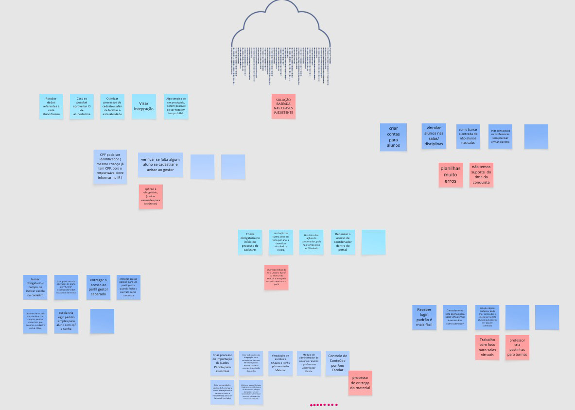
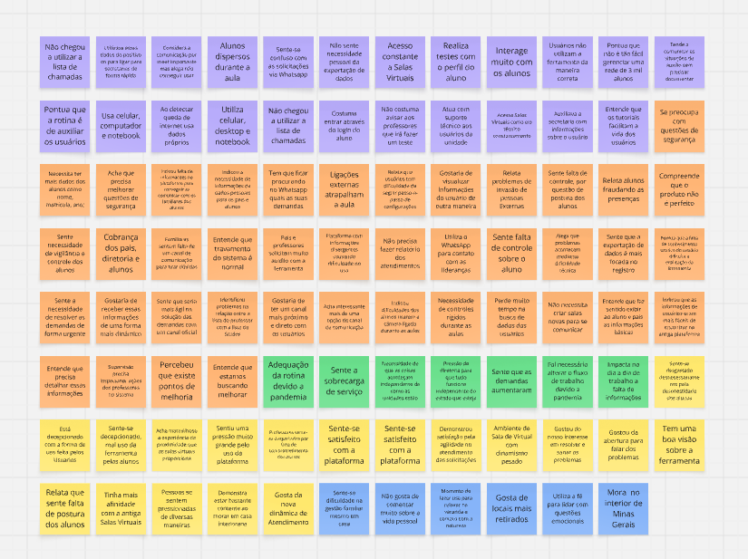
The main findings included:
1) All 5 participants admitted to having overloaded their schedules at least once during the process.
2) Several described feeling stressed or guilty when they were unable to finalize class rosters or did not understand the platform.
3) Most stated that they had to take several days off during a certain period just to register students and teachers on the platform.
4) Participants emphasized that communication is essential: prompt responses regarding duplicate names, missing personal data, or notifications about registration requests made by the student’s family.
5) These observations confirmed that the issue was not merely that the tool had confusing and ineffective steps, but that empathy and organization were also necessary at every stage of the registration process.
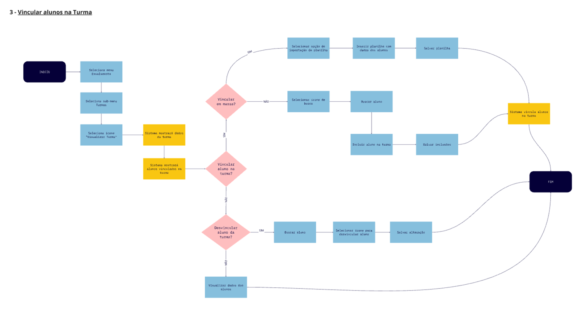
Flows
The flow was created to bring clarity to the process and its requirements, ensuring consistency and enabling more confident progress to the next steps.
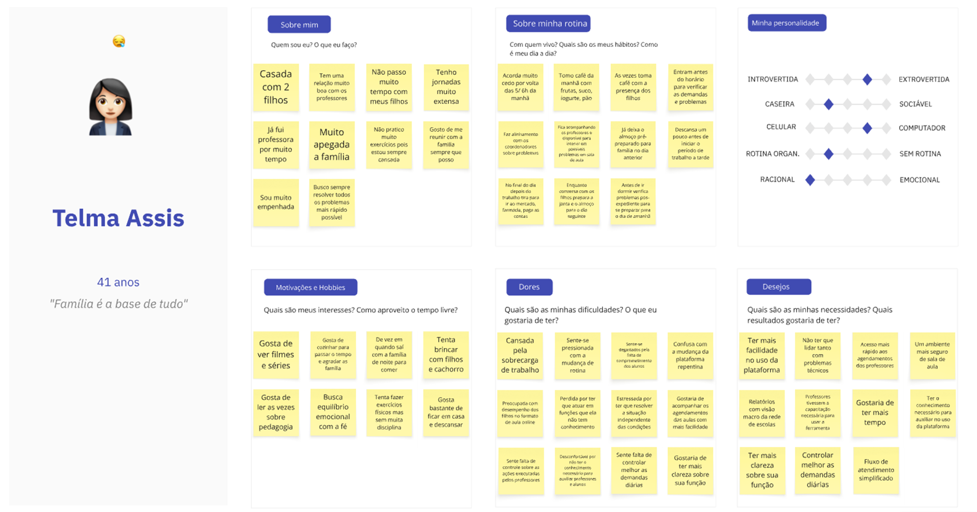
Persona
Creating a persona was a key step in translating the research into a practical design. The initial interviews revealed that managers were facing a disorganized and confusing process. To capture these needs, I created a persona that went beyond superficial demographics, focusing instead on emotional motivators: the desire for clarity and the need for organization in the registration process.
Final Result
After exploring all possibilities within the predefined timeframe, we arrived at a result that aligns with the user’s expectations, offering improved usability and a more polished user experience.
Check the product: